From local to leading. Built in six days.
A basic template replaced with a custom build — still maintained, still evolving.
- 6 days
- Delivery
- Pro
- Package
- Live
- 2026
Project summary
The full transformation.
TruLuxe is the clearest example of what a stronger website can do for a referral-heavy service business when the real work already deserves better presentation.
Before and after
The project reads differently now.
The shift is visible immediately: the old site felt flat and undersold, the new one feels more intentional, more premium, and easier to trust.
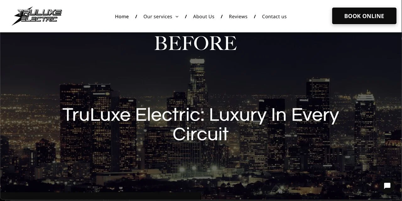
Template feel
Basic structure, weaker service hierarchy, less trust on first glance, and very little brand personality.
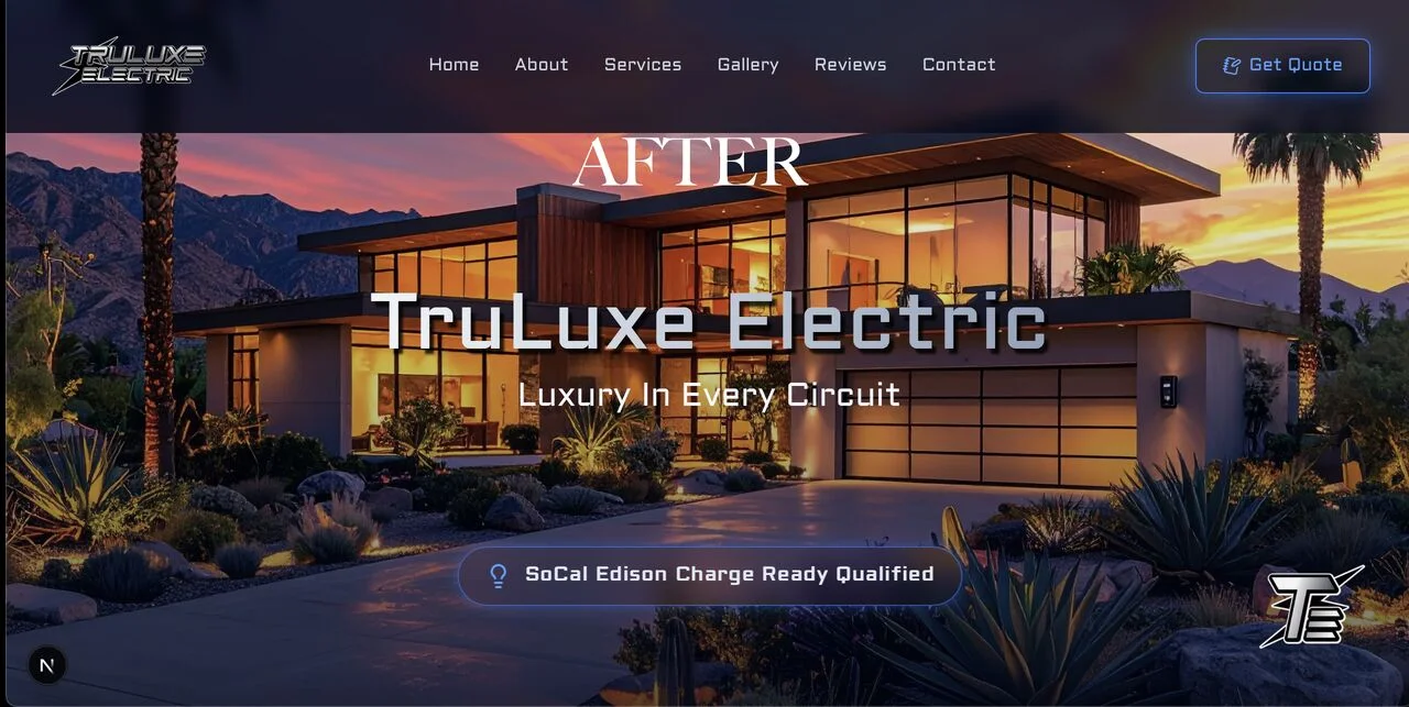
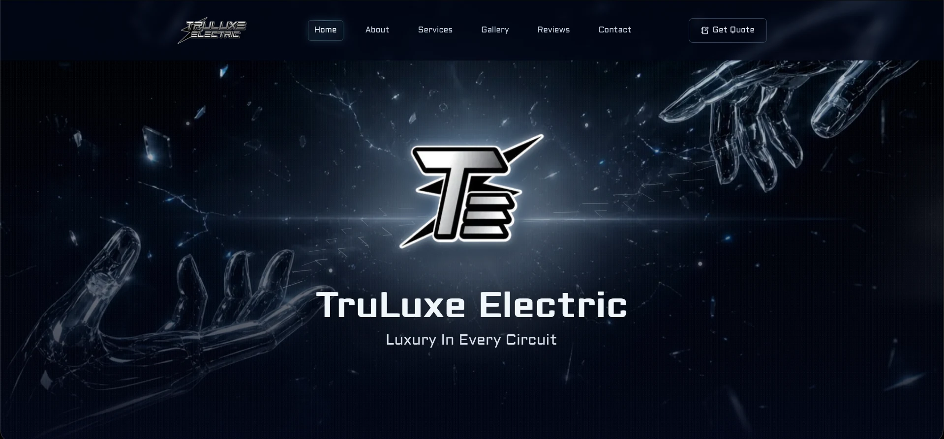
Clearer structure, stronger confidence
A custom build with cleaner pacing, sharper service framing, stronger mobile trust, and tighter alignment with the business.
Desktop presentation
Client-ready framing for the strongest moments.
The raw screens show the build. These framed shots give the case study its cleaner portfolio moment without hiding the real work.
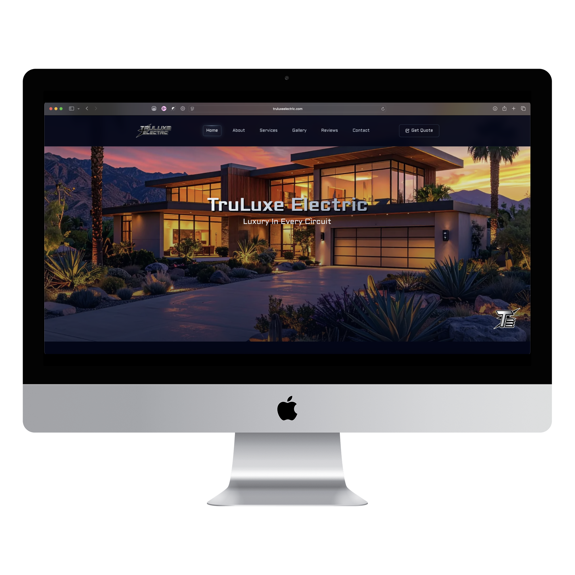
The strongest first read
Luxury home imagery, brand mark, and the full above-the-fold impression in one desktop frame.
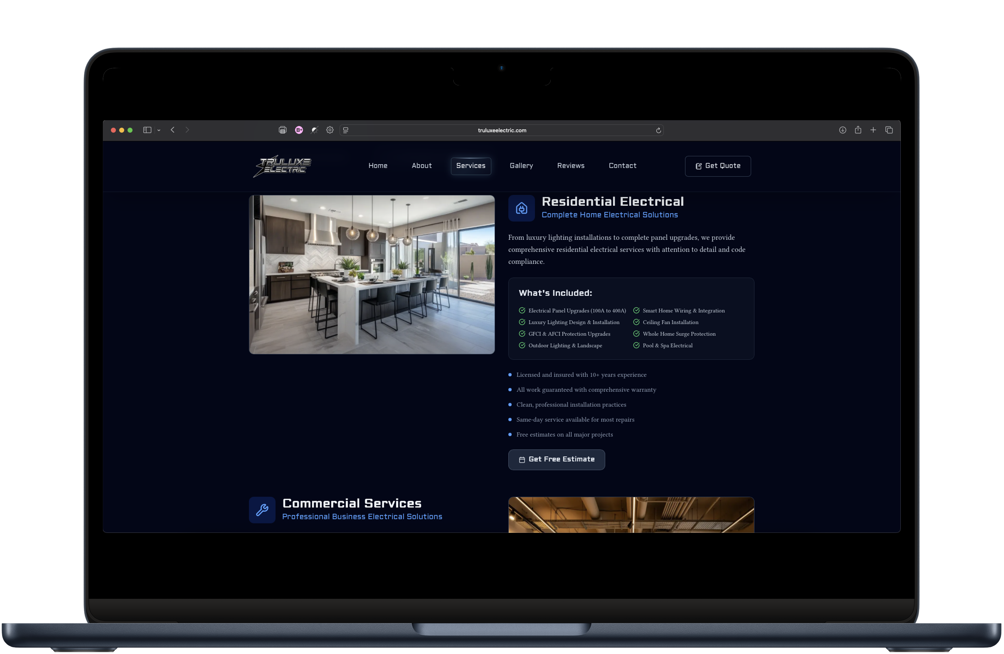
Conversion support
A second angle that keeps the project grounded in what the business sells: clearer services, trust cues, and a quote path.
Marketing campaign
Charge Ready support that matched the site.
The site was supported with campaign pieces that carried the same palette and message across the customer-facing material.
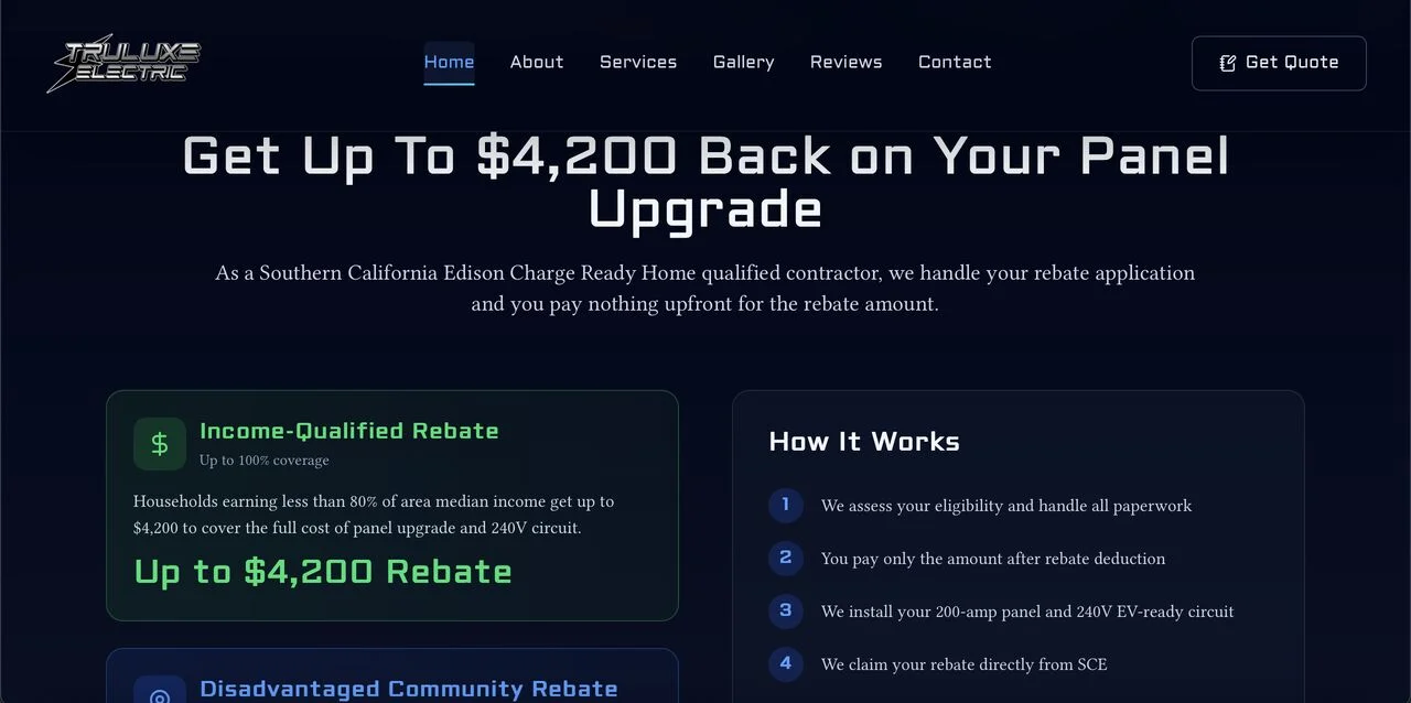
Charge Ready creative
A campaign visual built to feel aligned with the updated site direction instead of looking like a disconnected promo.
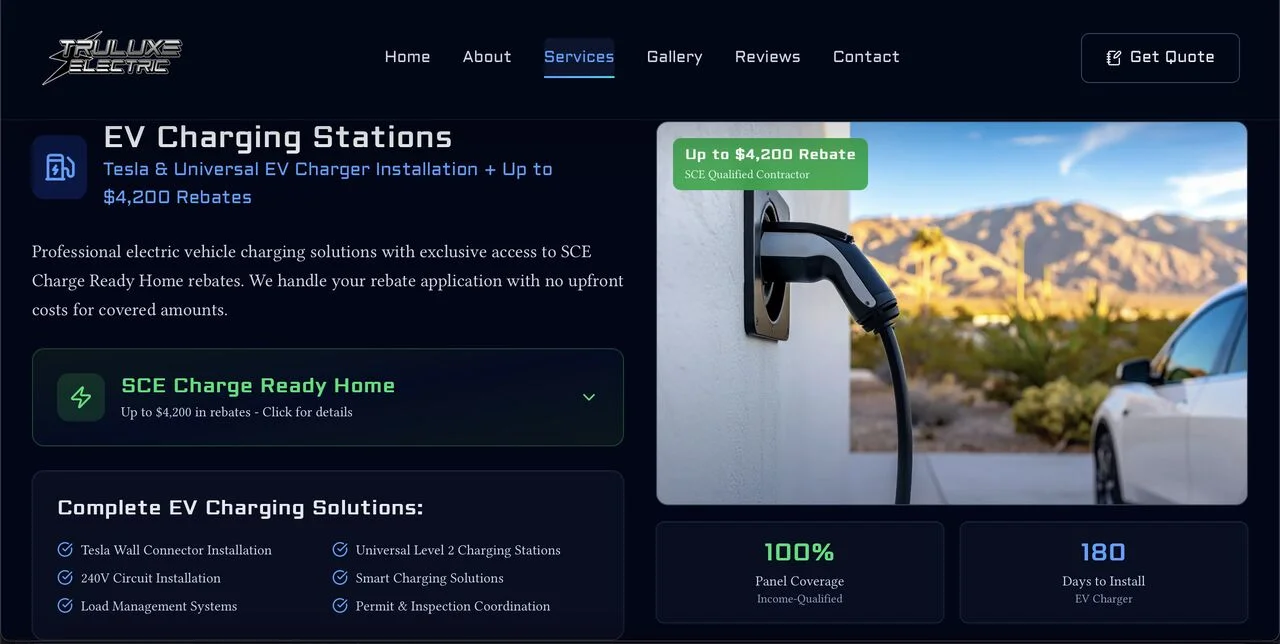
Companion layout
A second layout that carries the same utility-program message with cleaner hierarchy and a more polished presentation.
Mobile experience
The mobile view deserves its own space.
Most first visits for a local service business happen on a phone, so the case study should show that outcome directly.
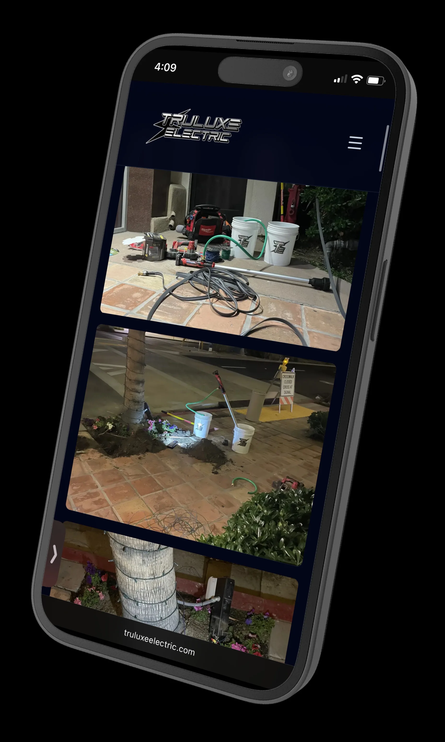
Proof of work on mobile
An angled mockup that gives the project photography more motion without drifting away from the site palette.
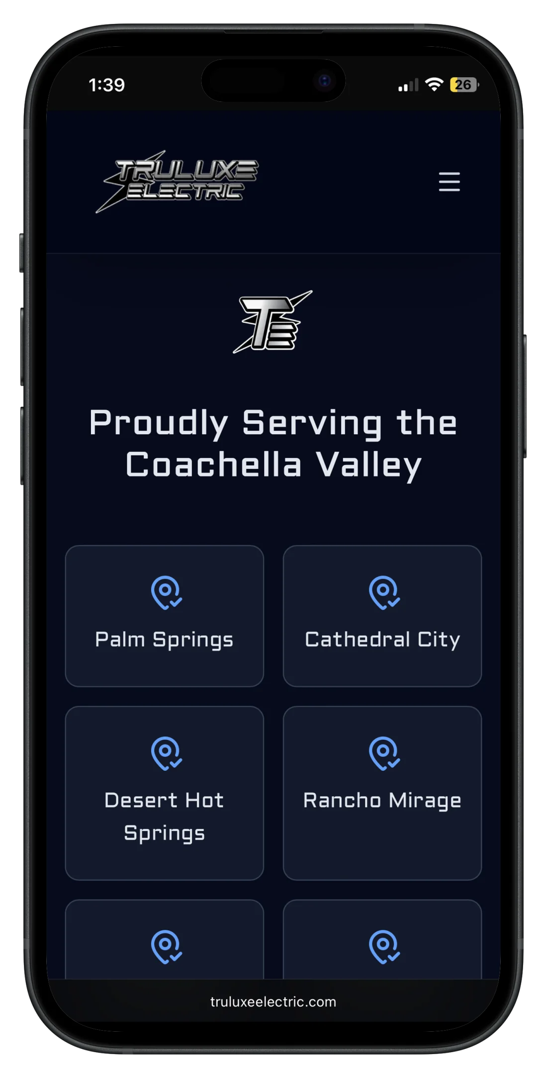
Coverage that lands fast
The straight portrait frame lets the coverage message land quickly and keeps the device finish aligned with the site palette.
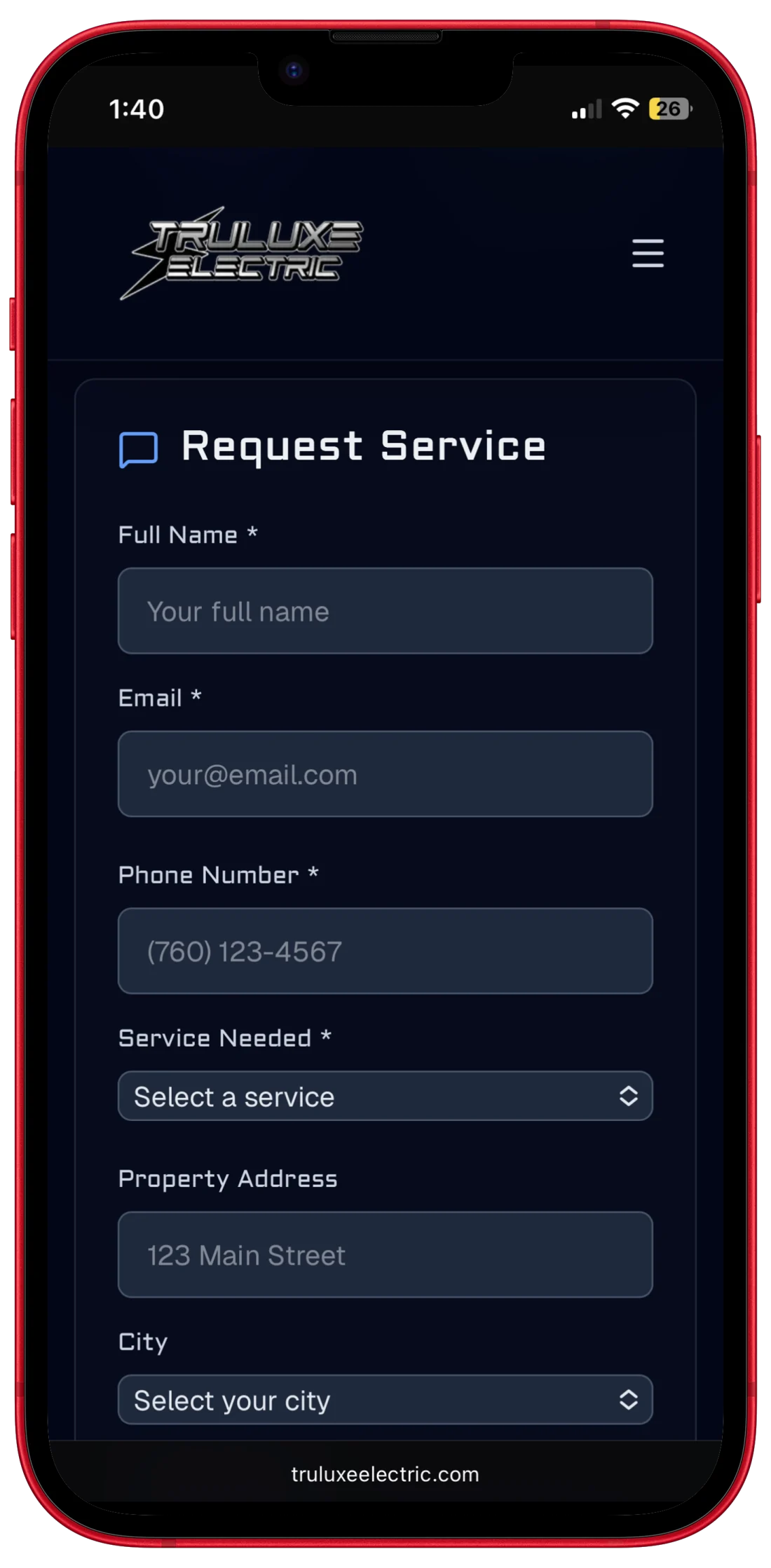
The close still feels easy to trust
The request flow closes the story well, and the red frame adds just enough pop without taking over the section.
Next step
Ready to build something like this?
The Pro package covers the kind of work shown here: custom site, brand alignment, and fast delivery when the business needs to start looking stronger quickly.
- Delivered in 6 days
- Remote collaboration
- Live site launched