From $497

Build a brand system that feels strong before the website even loads.

Brand direction covers the core identity and the rollout layer around it: logo direction, typography and color posture, print-ready touchpoints, and launch-facing assets that keep everything feeling like one system.

Identity foundation Print-ready assets Launch support Cohesive rollout
Identity first when the current look feels improvised
From $497 starting point for the brand direction lane
Launch assets so rollout visuals do not feel disconnected
System mindset across logo, type, print, and presentation

What is included

Core brand pieces plus the rollout layer around them.

The exact deliverables can flex with scope, but the structure stays the same: build the identity foundation, translate it into client-facing assets, and make sure launch visuals do not feel like an afterthought.

01 Identity direction

Logo, type, color, and posture.

The identity is shaped as a working system so the brand feels deliberate and recognizable across everything people touch.

  • Primary and supporting logo direction
  • Core color and typography choices
  • Usage direction to keep day-to-day output consistent
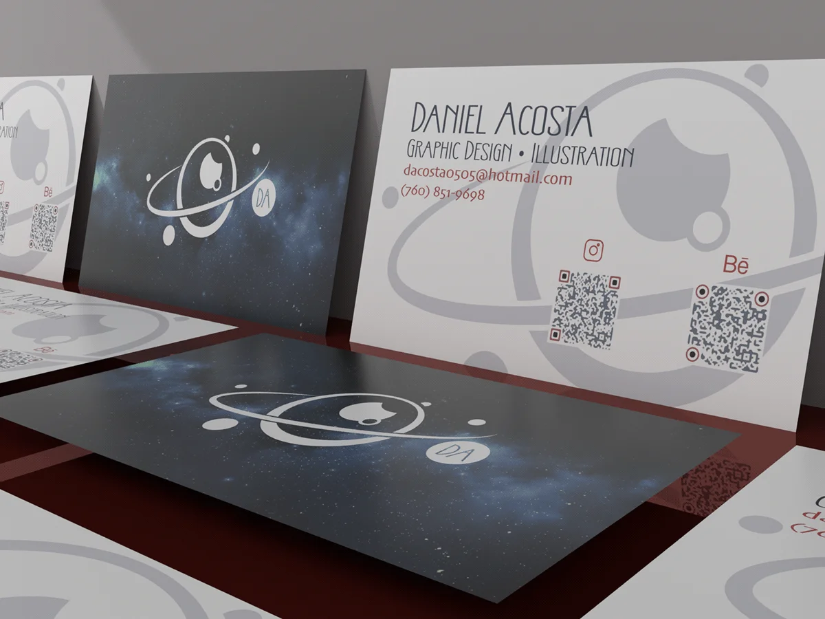
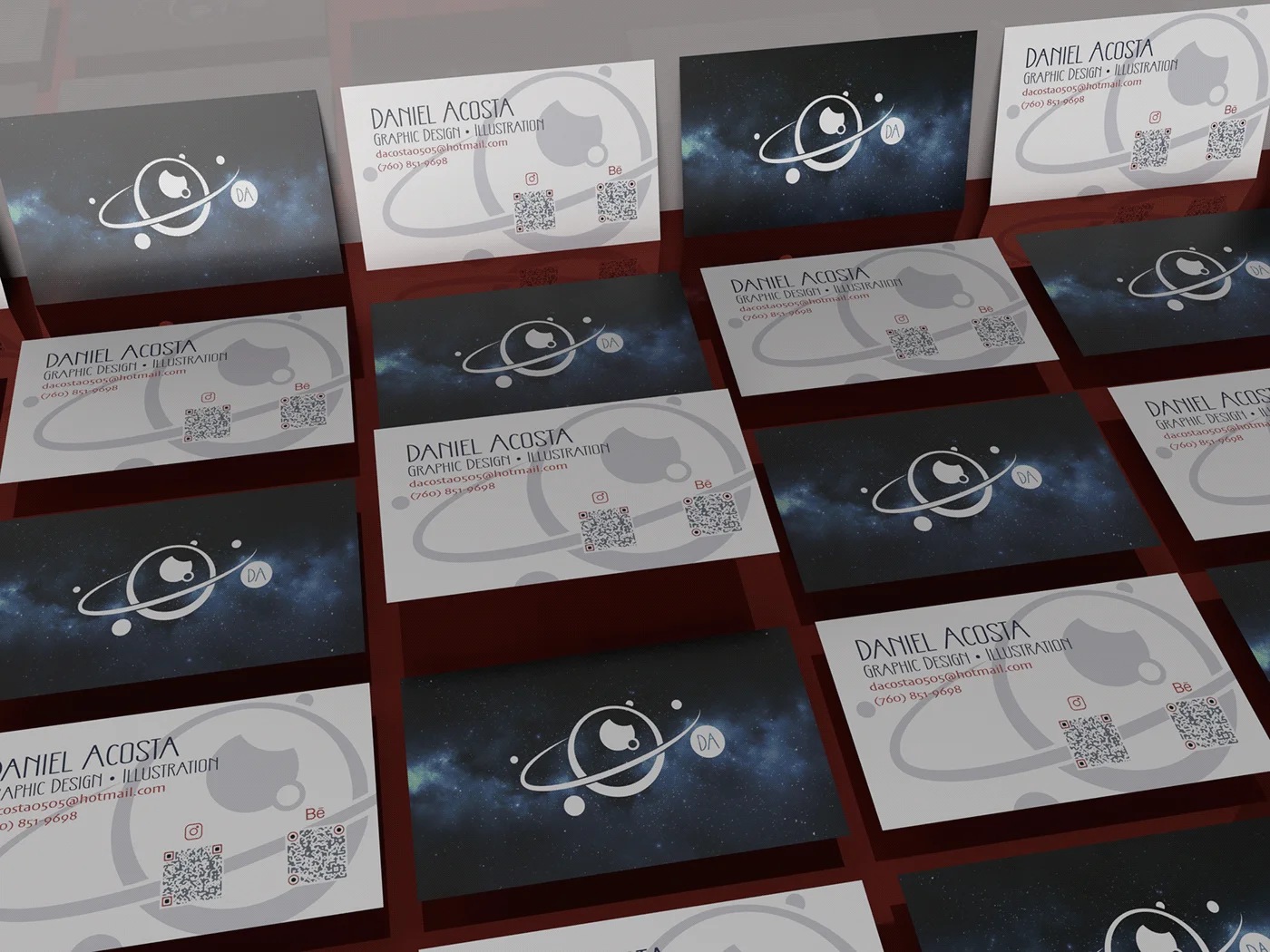
02 Client-facing assets

Pieces people actually see first.

Cards, profile assets, and launch-ready files are included so the brand shows up cleanly in real client conversations.

  • Print-ready business card direction
  • Profile and social image support
  • Launch-facing contact and presentation assets
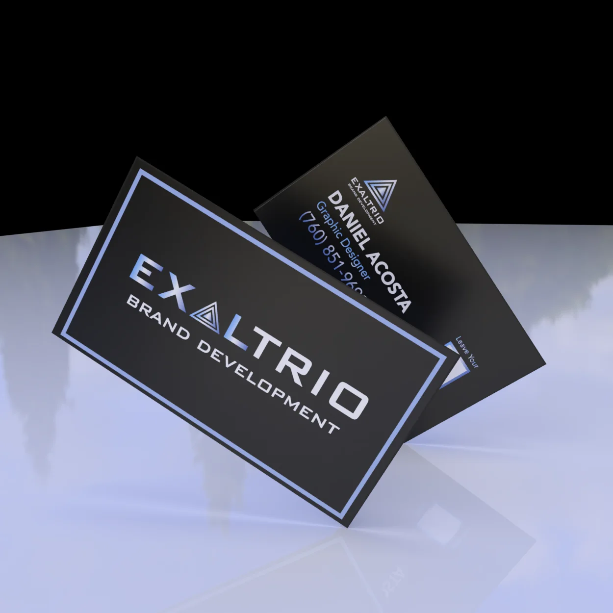
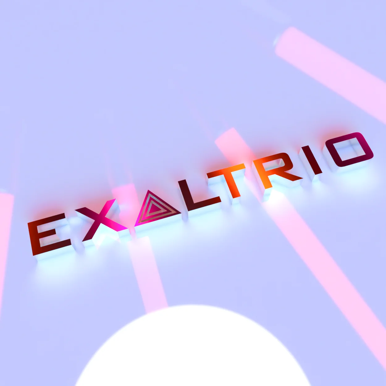
03 Launch layer

Reveal assets that carry the rollout.

When launch momentum matters, we add presentation visuals and dimensional treatments so the reveal does not feel flat.

  • Campaign-style reveal visuals
  • Dimensional or 3D treatment direction
  • Launch support so the handoff stays usable

Examples

Artifacts that carry the identity beyond the logo file.

These examples show how the visual direction gets translated into practical materials that support real launches and client-facing presentation.

Daniel Acosta business card close-up render
Business card system

A card system that keeps the mark and contact layout working together instead of fighting for attention.

Daniel Acosta business card system mockup
Rollout context

Showing the identity in context helps the brand read as real, not just as a logo file export.

Business card mockup example
Print presence

Print-side execution keeps the physical touchpoints as polished as the digital ones.

Dimensional brand treatment
Dimensional treatment

Dimensional mark treatments create stronger hero moments for launch visuals and presentation.

Best fit

Use this lane when the brand is the weak point.

Brand direction is usually the right move before a bigger site build when the current presentation is not matching the real quality of the work.

A1

Good fit.

  • The business has strong work but a weak visual identity.
  • Client-facing materials feel inconsistent or improvised.
  • You want a cleaner launch before investing in more channels.
A2

Likely next lane.

  • Move into the website service lane once the identity is stable.
  • Bundle with website work when timeline is tight and connected.
  • Keep integrations scoped separately when backend complexity appears.

Next step

If trust is thin, start with the brand foundation.

Share what currently feels off in the brand and where it is failing in real use. We will map the cleanest brand-direction scope and define the next step from there.