Build the visual system before the business starts feeling bigger than its brand.
This service is for businesses that already do good work but still look too pieced together online or in person. The goal is not just a logo. It is a clearer identity, stronger hierarchy, better leave-behinds, and a visual direction that feels established from the first glance.
Logo exploration, hierarchy, and collateral direction are shaped together so the brand feels coherent instead of assembled piece by piece.
What Is Included
The core pieces that make the brand feel real.
The exact mix depends on the package, but these are the pieces that usually matter most when a business needs a stronger first impression without overcomplicating the rollout.
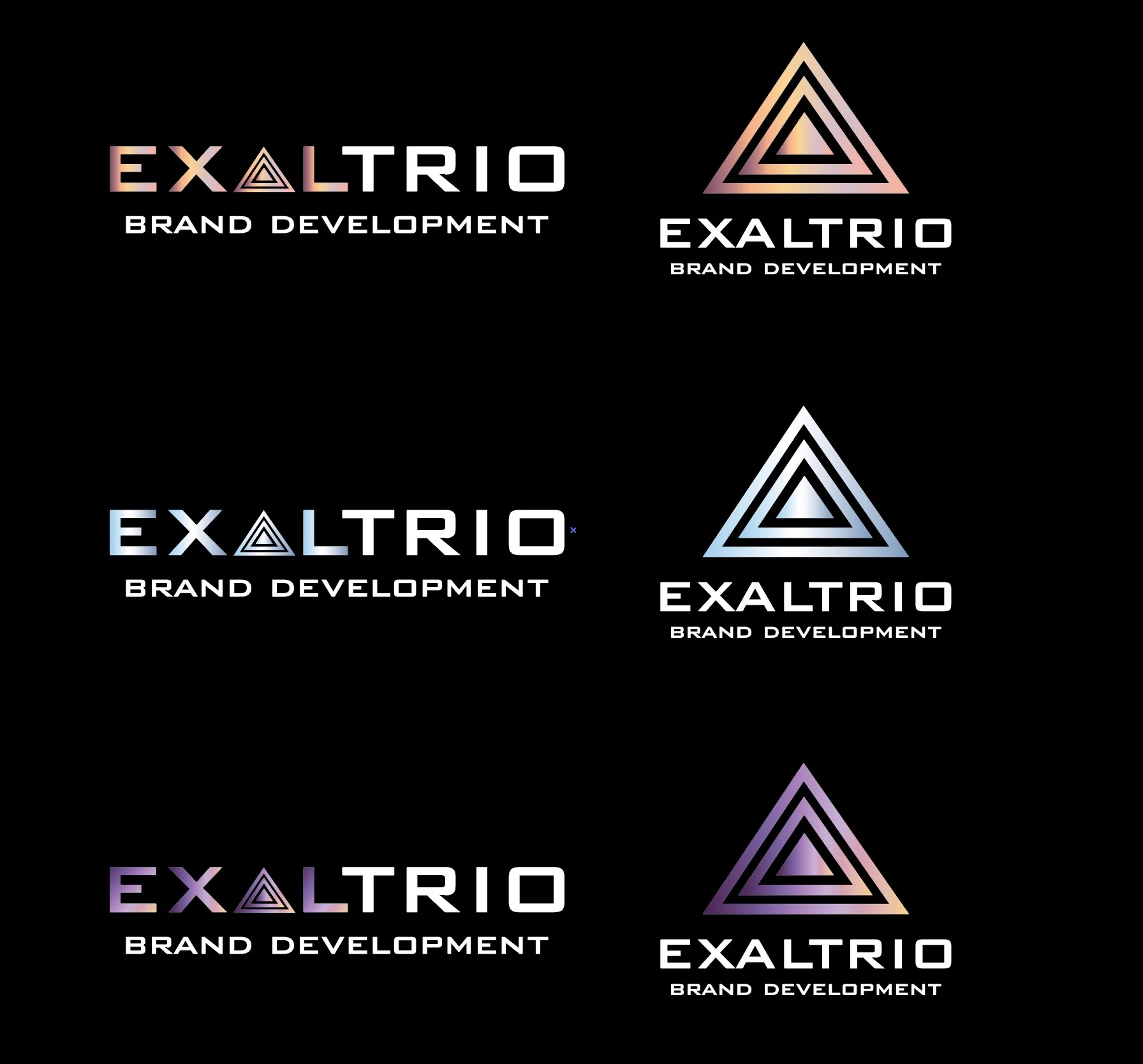
Identity Direction
Logo, type, color, and posture.
The point is not to stack effects. The point is to make the business look more decisive, more polished, and easier to trust.
Primary logo direction
Supporting color and type choices
Usage direction that keeps things consistent
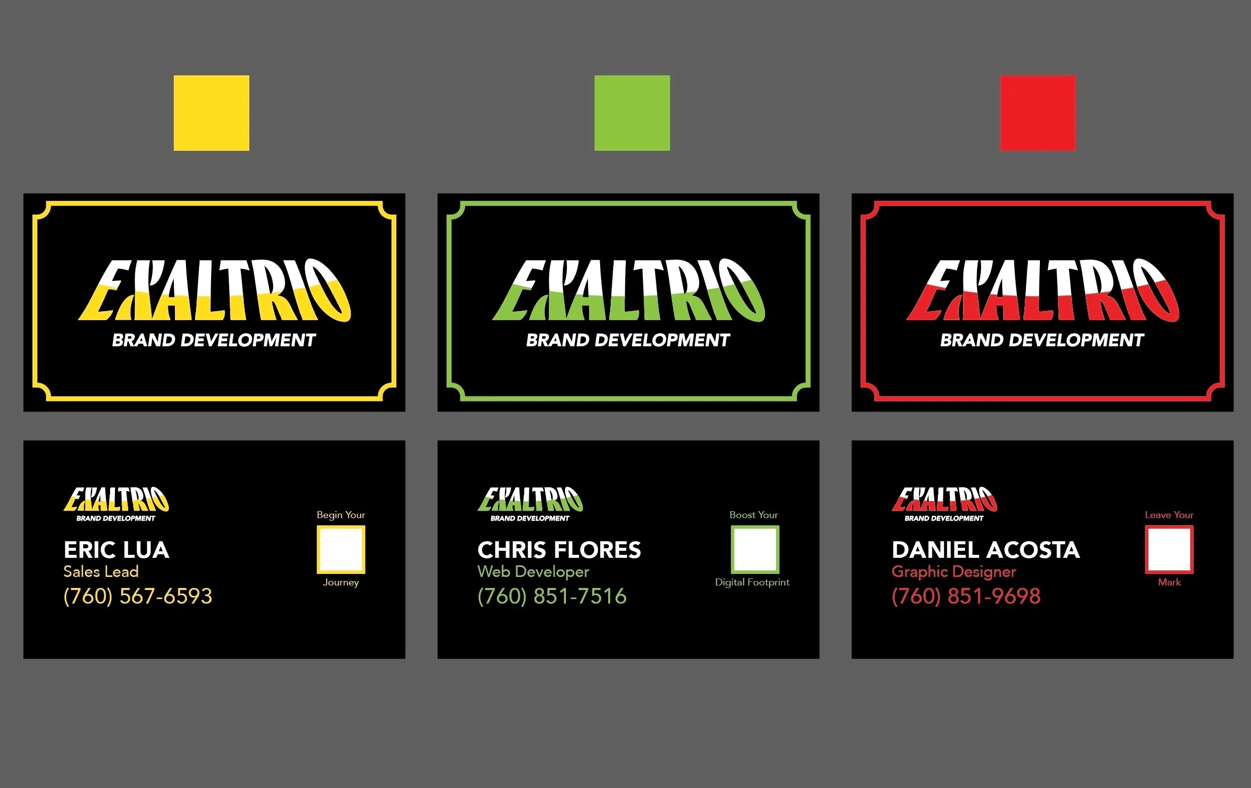
Client-Facing Assets
Pieces people actually see.
Business cards, profile assets, and polished visuals help the brand feel tangible long before a full website is involved.
Print-ready business card direction
Social profile graphics
Launch-ready contact materials
Local Presence
Profile alignment that matches the brand.
When the Google Business profile and contact touchpoints match the identity, the whole business feels tighter and more intentional.
Google Business profile setup support
Basic image and profile alignment
Cleaner first impression across touchpoints
Process
How the identity gets clarified.
01
Clarify the first impression.
We figure out what currently feels too generic, too messy, or too small about the way the business presents itself.
02
Shape the visual direction.
Typography, logo posture, color, and supporting assets are tightened into a direction that feels more aligned and more premium.
03
Package the rollout pieces.
The brand gets applied to the actual materials people will see so the result feels usable, not theoretical.
Best Fit
Who this is usually for.
Early businesses that need to look more established.
Perfect for owner-led service businesses, solo operators, and small teams whose work is better than their current visual presentation.
Businesses preparing for a sharper web launch.
A stronger identity makes the website, the collateral, and the launch materials read like one business instead of separate files.
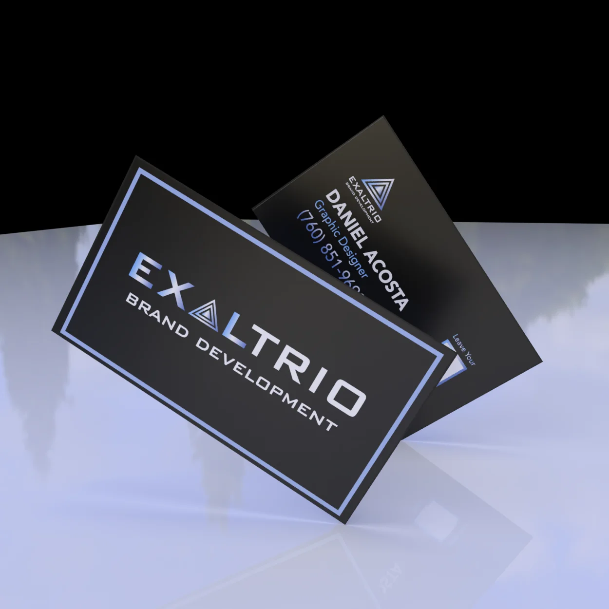
Examples
Artifacts that carry the identity beyond the logo.
Contact materials should feel considered enough to support the brand, not like an afterthought exported at the end.
Premium mockups and presentation assets help the brand feel tangible and make the handoff feel more complete.
Next Step
If the identity is the weak point, start here.
This is usually the cleanest first move when the business needs better presentation before a fuller site or rollout starts.